
App design
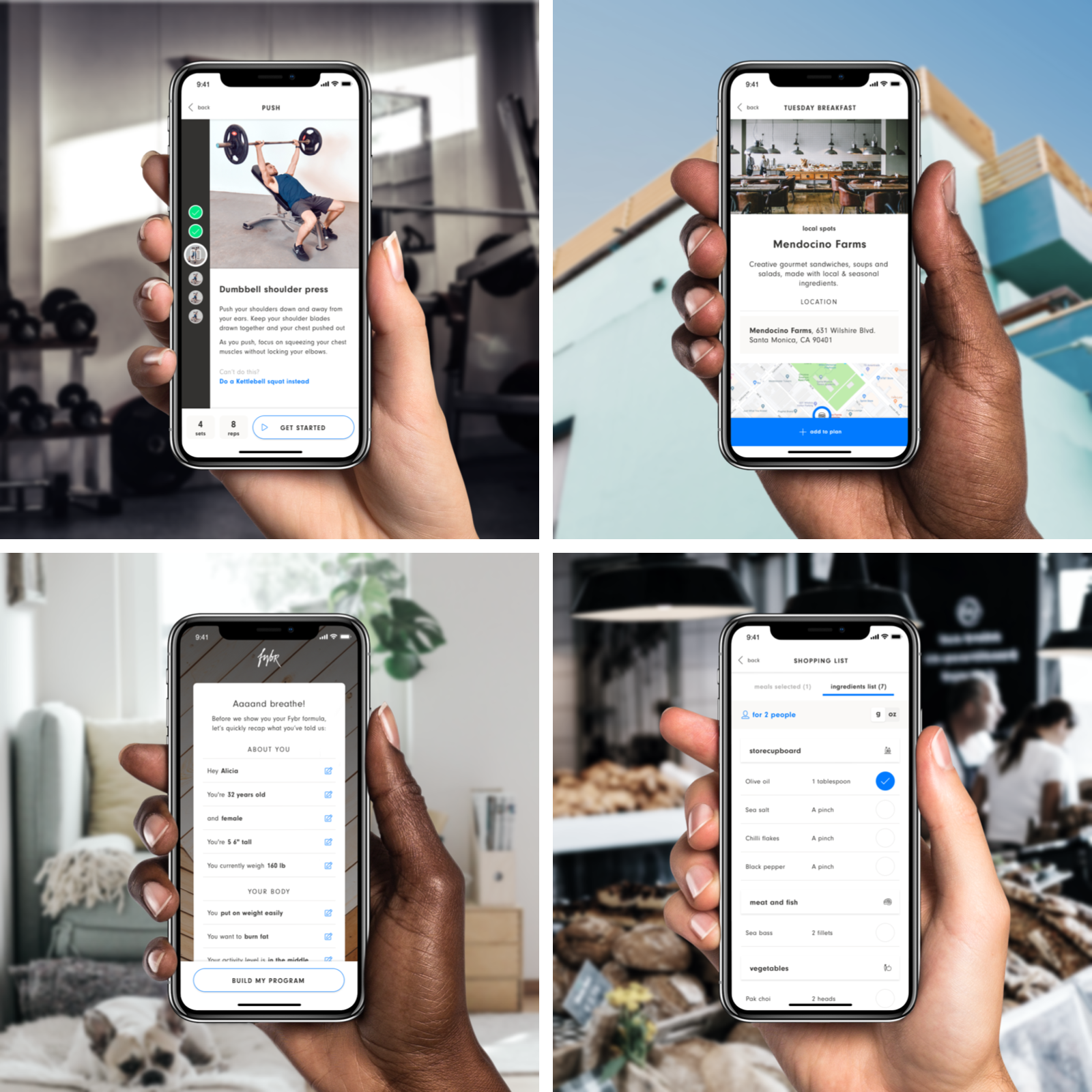
I was first brought on to develop a prototype to put in front of potential users and investors. The requirements were that this prototype be relatively full featured, for use in user testing, requiring that the users could fully complete workouts and see videos. For this we used Marvel. A year later, I was brought back into the project, The founders had brought on Revyrie to incubate and develop the app and had signed off on a feature list, which I first had to organise into a coherent user experience.

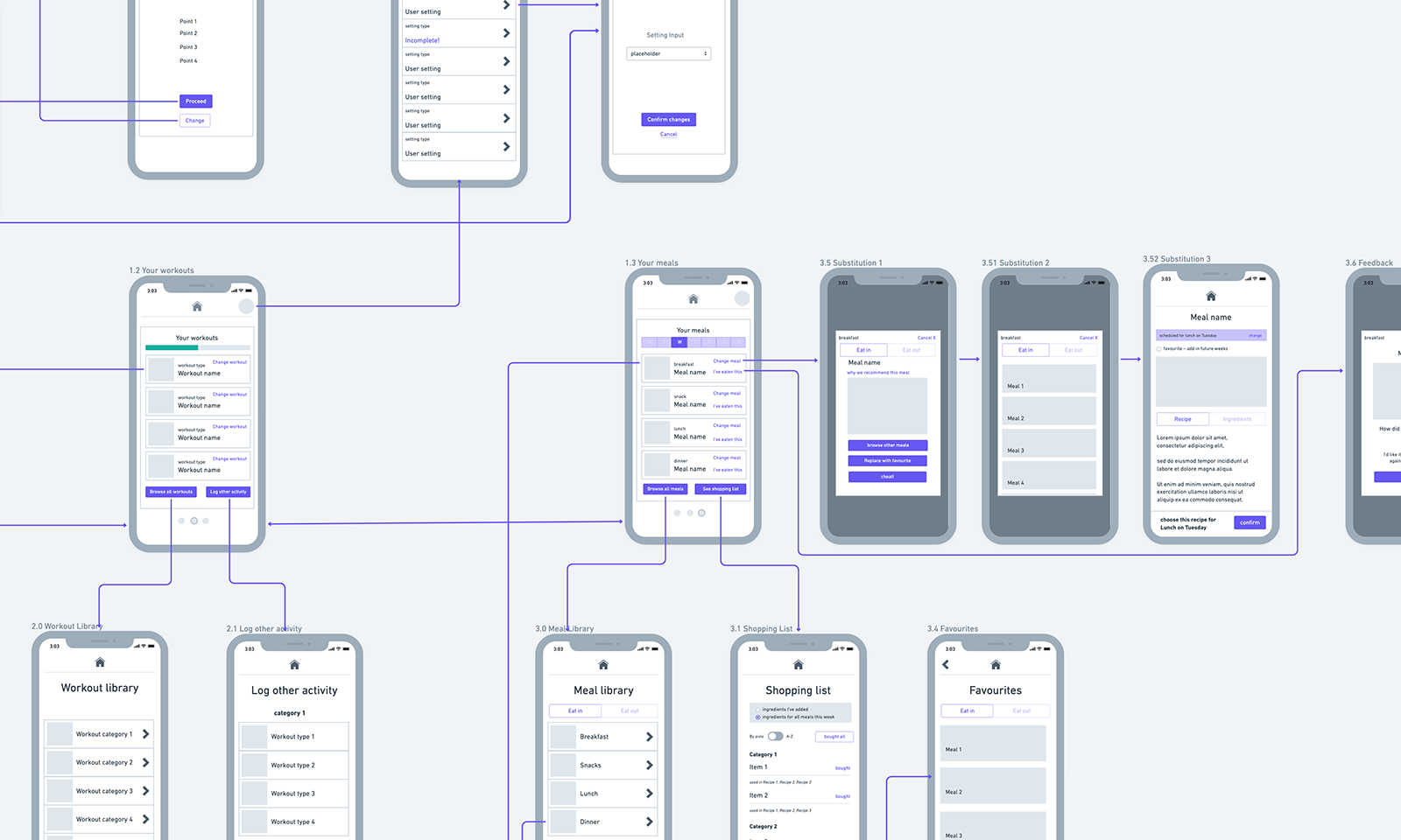
To work with the development teams workflow, we created detailed wireframes in Whimsical and designs in Sketch, for both iOS and Android and provided detailed interactive direction

Brand Direction
Concurrently with this, we started looking at brand direction, working out how to distinguish the product in a crowded field, and speak to users who were under-served elsewhere.
The initial direction was purposely very neutral, the idea being that it would be completely adaptive to the users preferences via the content, local suggestions and preferences. It used a broad, clean aesthetic that fitted with a global base of users expectation of what a modern tech service would look like.

However, as the competitive landscape changed over time, with new players in the space, it became clear that an intervention was needed to recalibrate the app to stand out and succeed in far more specific business goals to a more targeted market.
- New players were arriving, and inhabiting a similar space.
- We were starting to see a trend of new fitness brands in this space which were far more personalised and aspirational – celebrity endorsed fitness programmes and apps which attempted to deliver the culture and camaraderie of an aspirational gym, to users who were unable to access them
- A smart pivot was then to move away from the blank slate that any global rival could compete with and instead be more targeted at users who would respond positively to the specific brand equity that Fybr already formed through its Los Angeles network. Through leading with an investment in the photography and video content, putting the instructors front and centre, and allowing their personalities and self-presentation for inform the look, we were able to create a far more dynamic, exciting brand.
- We created a dynamic, scripted logo, with the assistance of a calligrapher, and refocussed the UI design and colour palette of the app to accommodate more colourful imagery.
